
Here's a fun example of how you might use my data on Congressional bill length and complexity (bommaritollc.com/insights/statistics-length-linguistic-co...). Imagine you want to understand the empirical distribution of Flesch-Kincaid reading level for Congressional bills and how this distribution is related to bill stage. A first step might be to visualize this relationship.
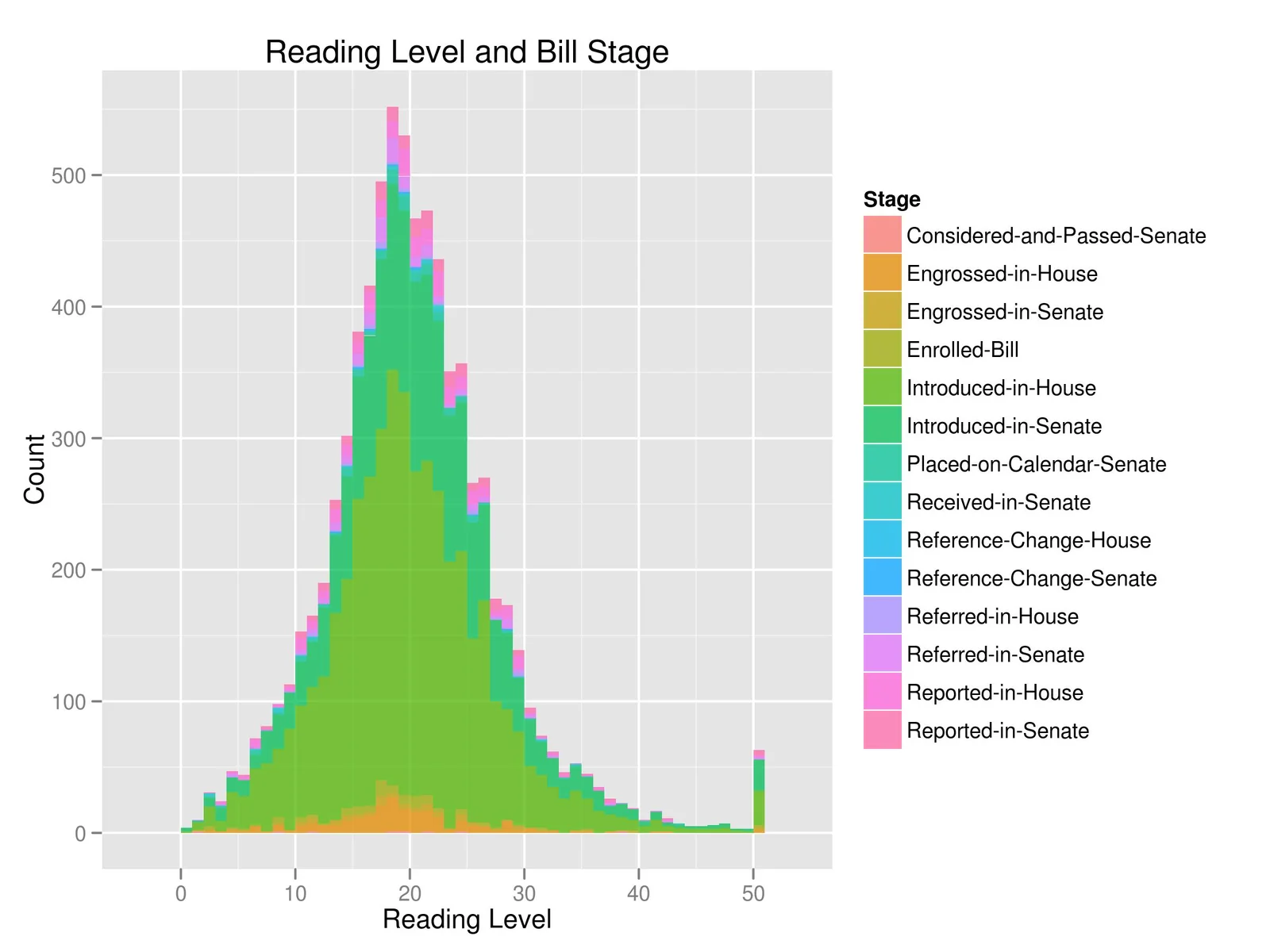
Based on this visualization, you might infer that engrossed bills tend to have less right-skew and have a lower mean reading level. The story behind this might be that Senators and Representatives are less likely to accept legislation they do not understand. To test this, you might run a simple KS test to see if the introduced bill reading levels are greater than engrossed bill reading levels.
> ks.test(introduced, engrossed, alternative="less")

	Two-sample Kolmogorov-Smirnov test

data:  introduced and engrossed
D^- = 0.094, p-value = 0.006299
alternative hypothesis: the CDF of x lies below that of y
Sample source below.